Orkester Design System
Orkester is a Norwegian scientific startup developing a data-heavy web platform. As the lead UX/UI designer, I was brought in to create a scalable, accessible design system that would unify the user experience across the product and website.
Role: UX/UI Design Leader
Company: Orkester (Norwegian scientific startup)
Project: Create a scalable, accessible design system that would unify the user experience across the product and website
Impact: 30% faster development, WCAG compliance, unified product & marketing UI
UI/UX
·
Product Design
·
Brand/Identity

Orkester is a Norwegian scientific startup developing a data-heavy web platform that helps researchers and labs organize, visualize, and share complex scientific data. As the company scaled, inconsistencies in the UI were slowing down development, impacting usability, and creating friction between their marketing and product teams.

Empathize
To ground my work in the needs of both users and developers, I began by meeting with internal stakeholders:
• Scientists and researchers using Orkester's platform needed a more intuitive interface for navigating large datasets.
• Developers were reinventing UI components from scratch due to a lack of shared standards.
• Marketing and product teams had diverging styles, leading to brand inconsistency.
I also reviewed user feedback and heatmaps, which revealed confusion around interactive elements and accessibility issues.
Define
After the research phase, I defined the core problems to solve:
• Inconsistency in UI patterns across the app and site
• Slow developer velocity due to lack of reusable components
• Accessibility gaps that failed to meet WCAG standards
• Disconnected brand experience between marketing and product
From these insights, I created a clear design objective: Design and document a modular, accessible design system that improves usability, development efficiency, and visual cohesion across Orkester’s digital ecosystem.

Ideate
I led brainstorming workshops with product and engineering to align on component priorities and usage guidelines. We mapped out the foundational elements of the system:
• Color, typography, spacing, and elevation tokens based on Orkester’s brand
• A component library in Figma with variants for buttons, form elements, tables, modals, and tabs
• Accessibility guidelines baked into each component
• Design principles focused on clarity, legibility, and scientific precision
To ensure the system would scale, I also proposed a naming convention and token structure that matched how developers worked in code.

Prototype
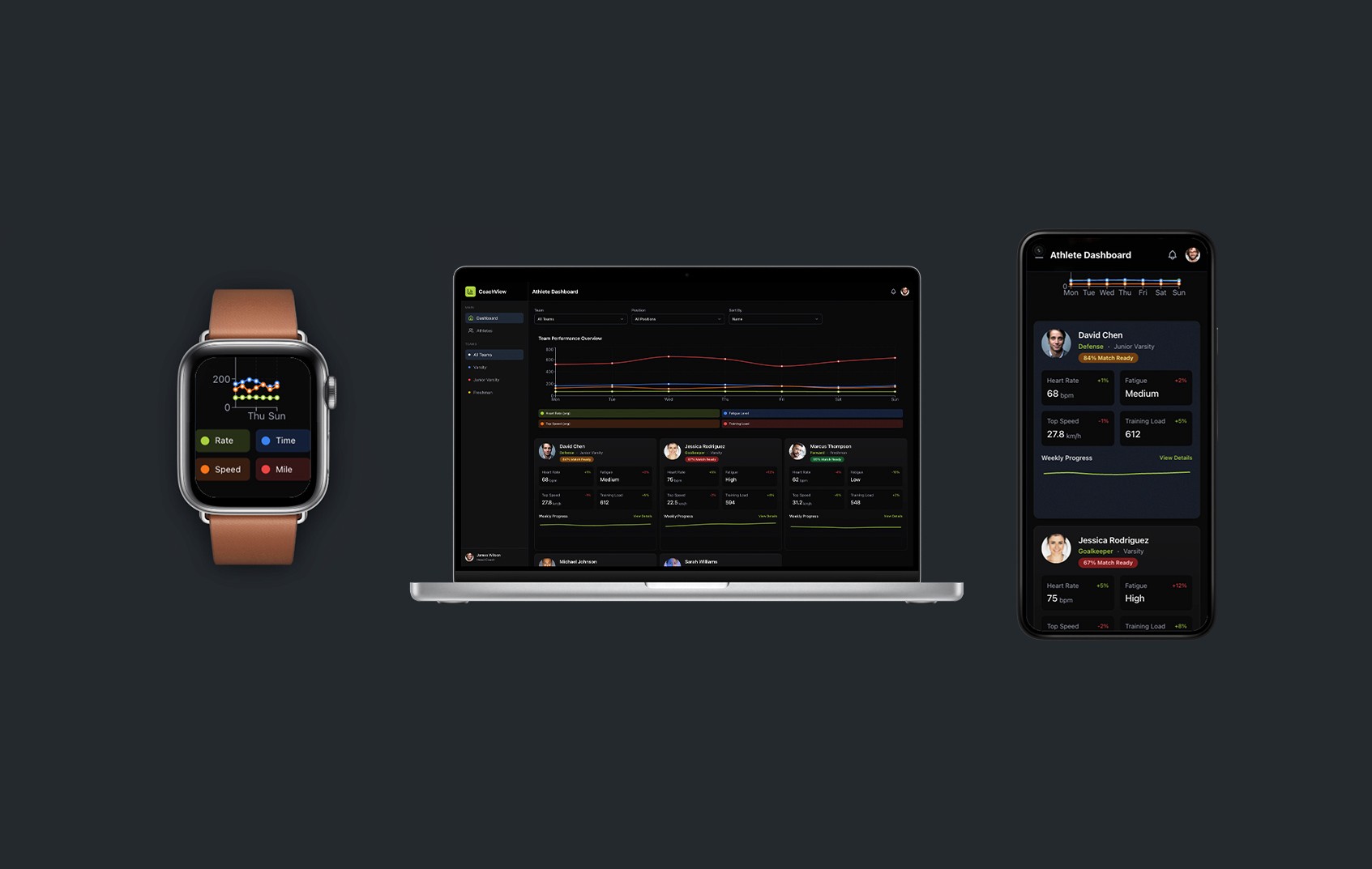
I created the design system directly in Figma, focusing first on atomic elements (colors, type styles, grid, icons) before expanding into components. Key deliverables included:
Component Library: Built with auto layout, variants, and constraints for flexibility across breakpoints
Design Tokens: Used across Figma and exported for front-end implementation
Documentation: Included component usage, dos and don’ts, and accessibility specs (WCAG 2.1 AA compliant)
Dark Mode: Designed for energy efficiency and readability in lab environments
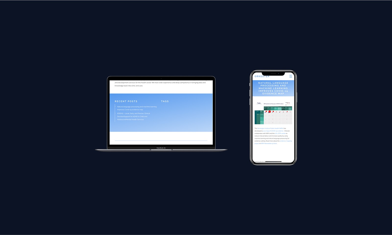
To bridge the gap between teams, I also worked with marketing to align the site’s visual direction with the product UI.
Validating with teams and measuring success
Internal usability testing and developer feedback confirmed the design system's impact. The design system became a foundational asset for Orkester, allowing product and engineering teams to build faster, with better accessibility and consistent branding across platforms. It's now used across all internal tools and is the standard for new feature development.