Investing Simplified
Investing Simplified aims to address the overwhelming complexity of traditional investing apps.
Problem: Most investing apps rely on heavy financial jargon and assume prior knowledge, making them inaccessible to beginners and atypical learners.
Audience: New investors and individuals underserved by traditional platforms due to knowledge gaps or cognitive differences.
Goal: To design an intuitive interface that simplifies investing for everyone, regardless of their prior experience or accessibility needs.
UI/UX
·
Product Design
·
Brand/Identity
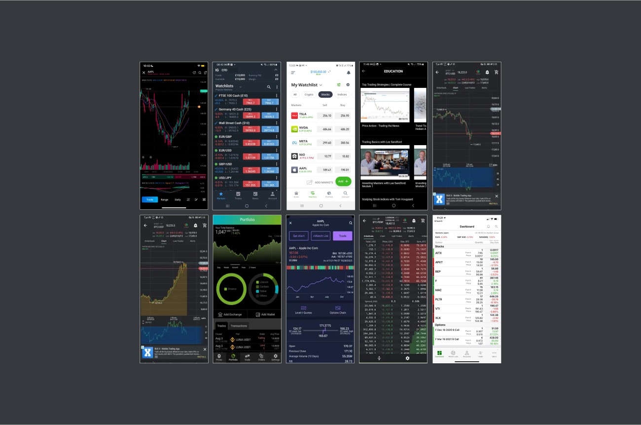
Competitor Analysis
Most investing apps follow a “one-size-fits-all” approach that overwhelms users, particularly beginners. These platforms rely on advanced financial terms, dense visuals, and data-heavy interfaces tailored to experienced investors. According to studies like MIT Sloan’s (2019), such complexity often leads to decision fatigue, leaving novice investors frustrated and excluded. Furthermore, many apps fail to meet the needs of neurodivergent users or accommodate assistive technologies, amplifying accessibility challenges.
Key Insights
Research findings revealed:
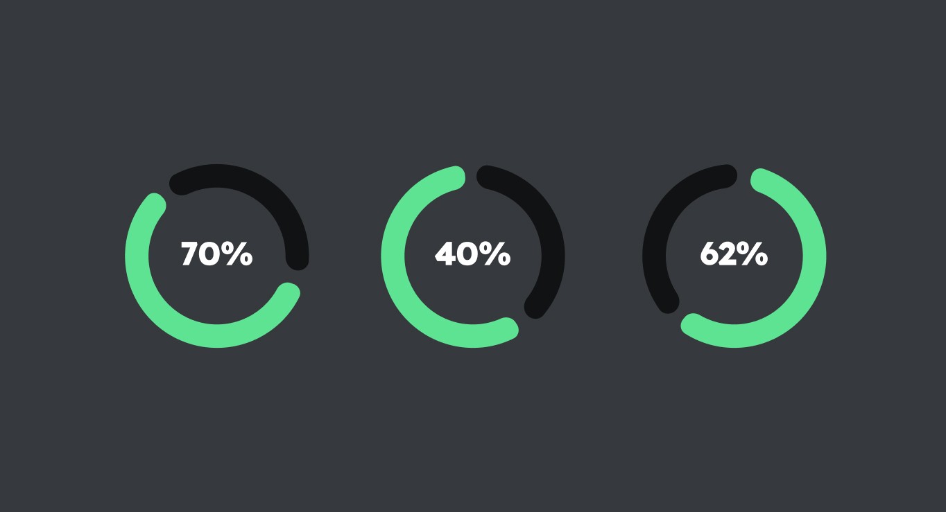
• 70% of self-directed investors feel stressed by unclear instructions and information overload.
• 40% of first-time users abandon investing apps within the first month due to complexity.
• 62% of users felt alienated as the platforms assumed prior financial knowledge.
Clarifying Needs and Personas
Investing apps often alienate beginners with excessive jargon and inaccessible design. To create a more inclusive platform, the app focuses on addressing three critical user needs:
Reducing Information Overload: Simplified visuals and processes to ease decision-making.
Clear Navigation: Helping users maintain a sense of direction throughout their journey.
Improved Accessibility: Ensuring adherence to universal design principles.
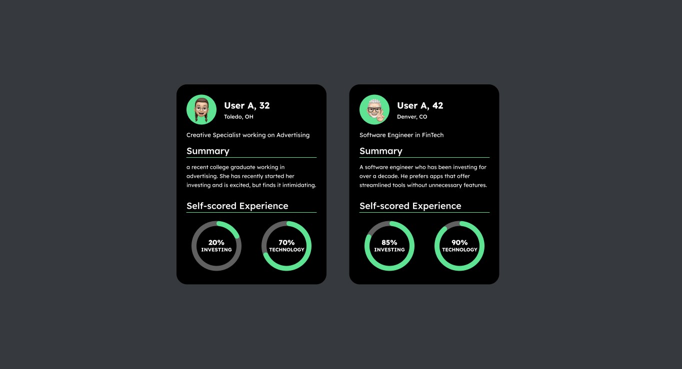
User insights were gathered from two interviews:
• A beginner investor shared frustrations with complex terminology and lack of guidance.
• An experienced investor highlighted the need for streamlined tools without unnecessary features.
These insights informed the design, ensuring inclusivity and usability for all experience levels.
Streamlined Design Approach
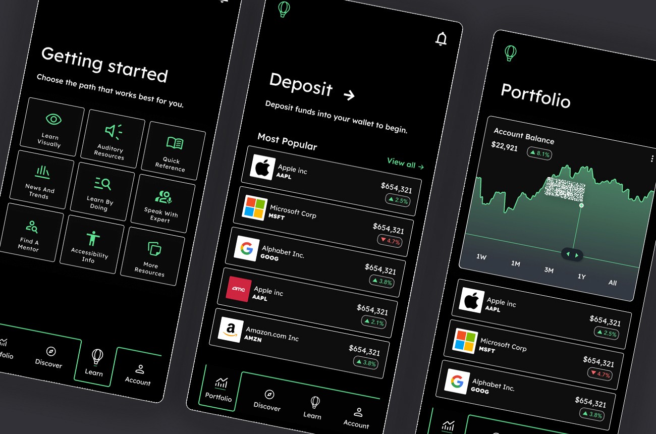
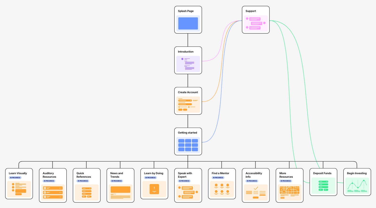
The wireframe for Investing Simplified reimagines the investing experience by organizing information into digestible sections. By breaking the user journey into small, intuitive steps, the app minimizes learning curves and provides seamless navigation. Instead of overwhelming users with excessive data, the design prioritizes clarity and simplicity, ensuring even beginners feel confident and supported.
Branding
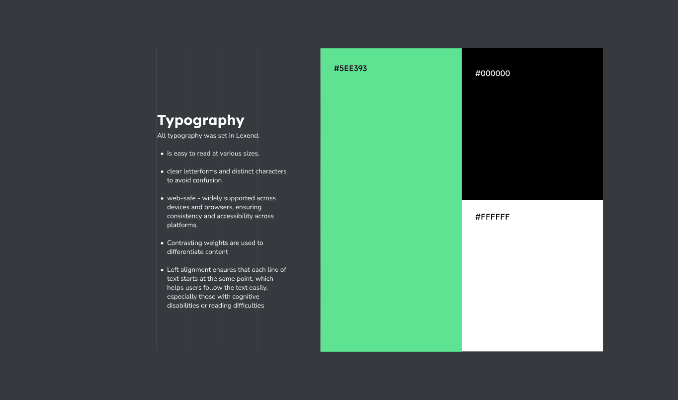
The app’s branding emphasizes accessibility and readability:
Typography: Lexend, a web-safe font with clear letterforms, ensures legibility across devices.
Layout: Left-aligned text and contrasting font weights enhance clarity, especially for users with cognitive disabilities.
Color Palette: A simplified three-color scheme with high-contrast elements ensures visibility and compatibility with assistive technologies.
Logo: A hot air balloon symbolizes cognitive defusion—a technique for gaining perspective on challenging thoughts.
Initial Designs
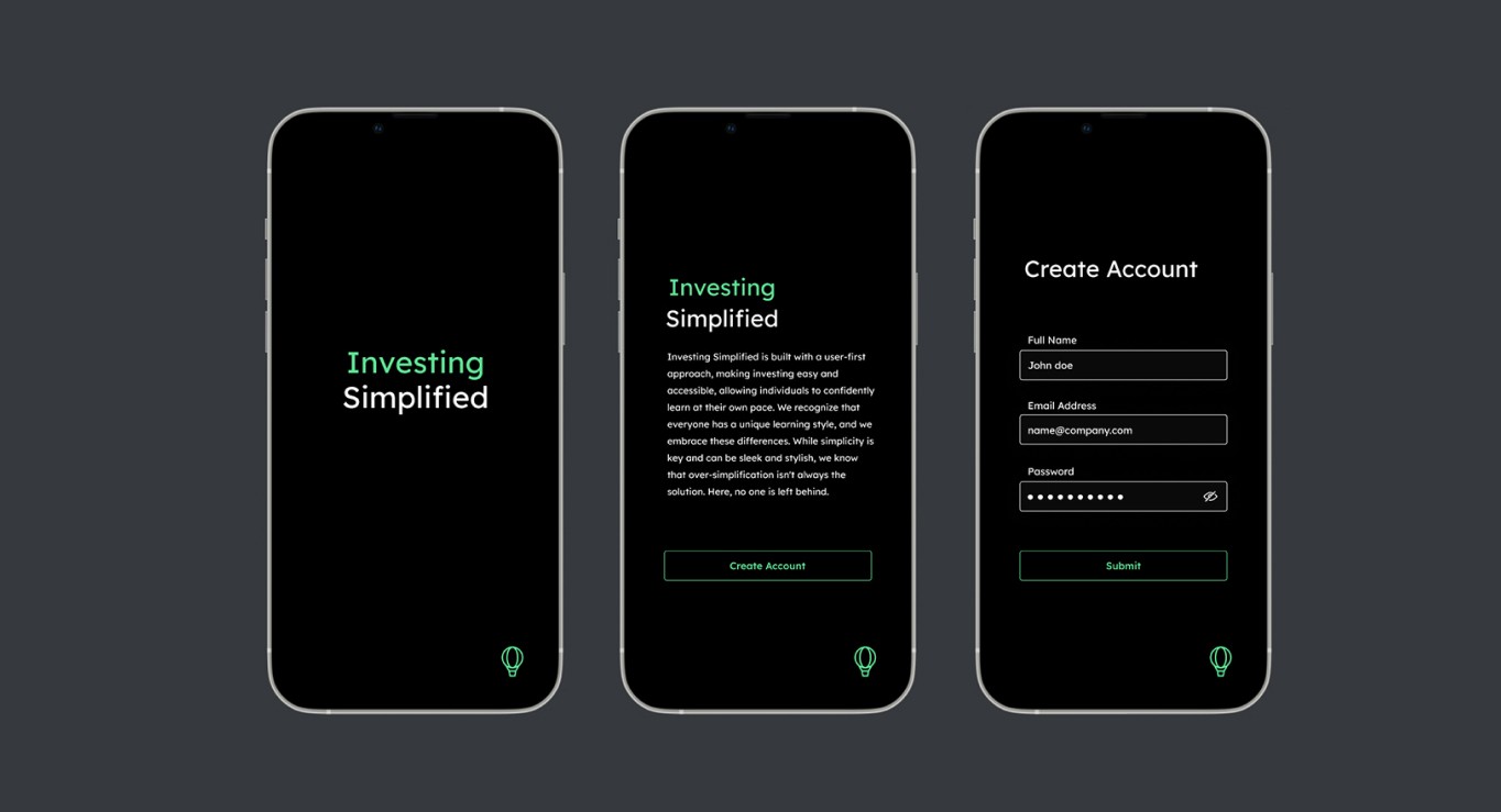
The early designs included five screens:
Introduction Screen
Account Creation Process
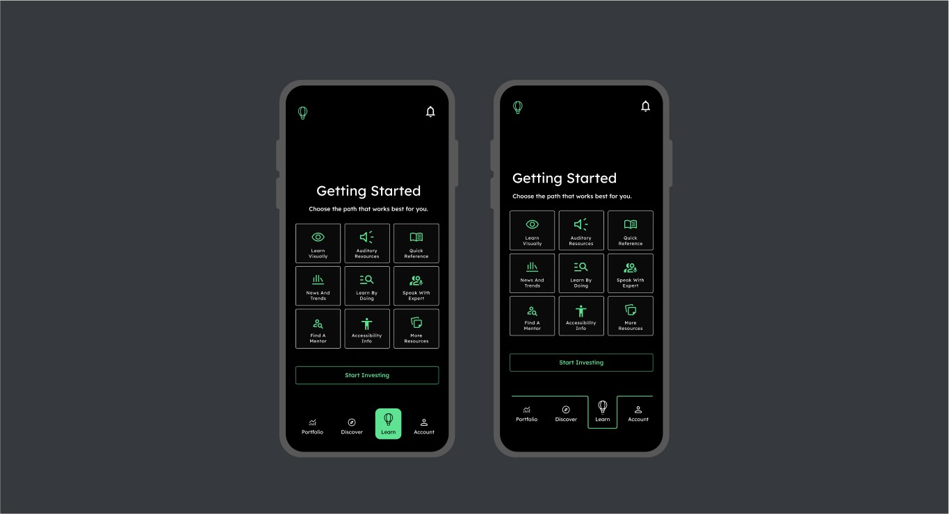
Learning Style Selection: Users can choose “Learn Visually,” “Learn Audibly,” “Learn by Doing,” or connect with a mentor inspired by platforms like ADPList.
Portfolio Page: Users can explore stocks and invest after depositing funds.
The goal was to create an inclusive experience that caters to different learning styles and levels of financial knowledge. By incorporating research findings, these designs simplify financial concepts into accessible, user-friendly formats.
Final Iterations
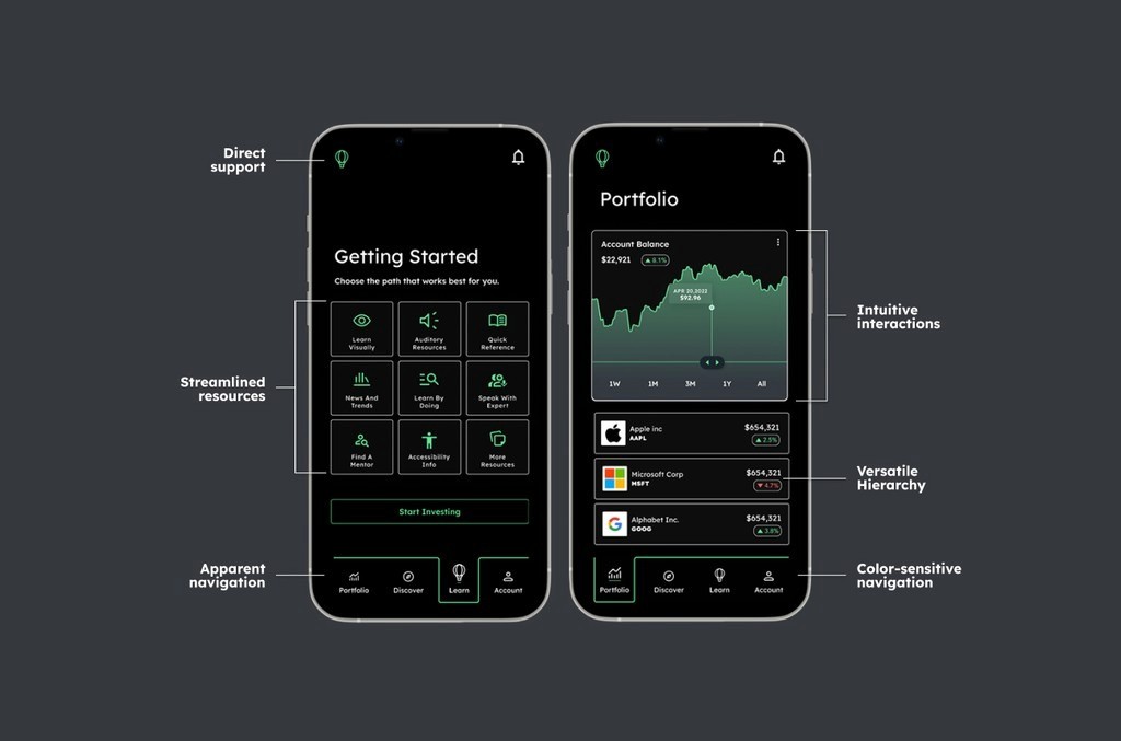
The refined interface prioritizes simplicity and accessibility. Screens feature fewer distractions, larger buttons, and visually digestible graphs. By reducing data overload, the app empowers users to focus on learning and decision-making without feeling overwhelmed.
Usability Testing
To validate the design, usability testing was conducted with 10 participants, including beginner investors and neurodivergent users. Participants completed tasks such as navigating resources, initiating investments, and accessing support. Post-session surveys captured ease of use, confidence levels, and overall satisfaction.
Key Findings:
Navigation Confusion: 40% of participants struggled to switch between learning modules and investment actions.
Subheader Clarity: Headers and subheaders lacked differentiation, affecting readability.
Visual Learning Aids: 60% of users preferred icons and simplified graphs over text-heavy explanations.
Addressing Feedback
Based on testing insights:
Improved Navigation: Added visual aids and color-blind-friendly indicators to guide users.
Enhanced Hierarchy: Adjusted font weights for headers and subheaders to improve readability.
Consistent Iconography: Introduced back arrows for smoother navigation, reducing user confusion.
Investing with Confidence
The final design ensures users can access learning resources effortlessly through video tutorials, written guides, or interactive tools. High-contrast visuals and clear typography enhance usability for all. By addressing gaps like complexity and accessibility, Investing Simplified empowers users to confidently navigate their financial journey and make informed decisions.
