Accessibility Rebrand
This rebranding project represents a complete visual and functional overhaul for a confidential client. My goal was to modernize the brand while ensuring its new identity adhered to the highest standards of accessibility and usability. Each phase of the redesign reflects a thoughtful approach to inclusivity, enhancing both the aesthetic appeal and user experience across all touchpoints. From color palette revisions to typography enhancements and restructured components, this project demonstrates how accessible design can seamlessly blend with innovation and style.
UI/UX
·
Product Design
·
Brand/Identity
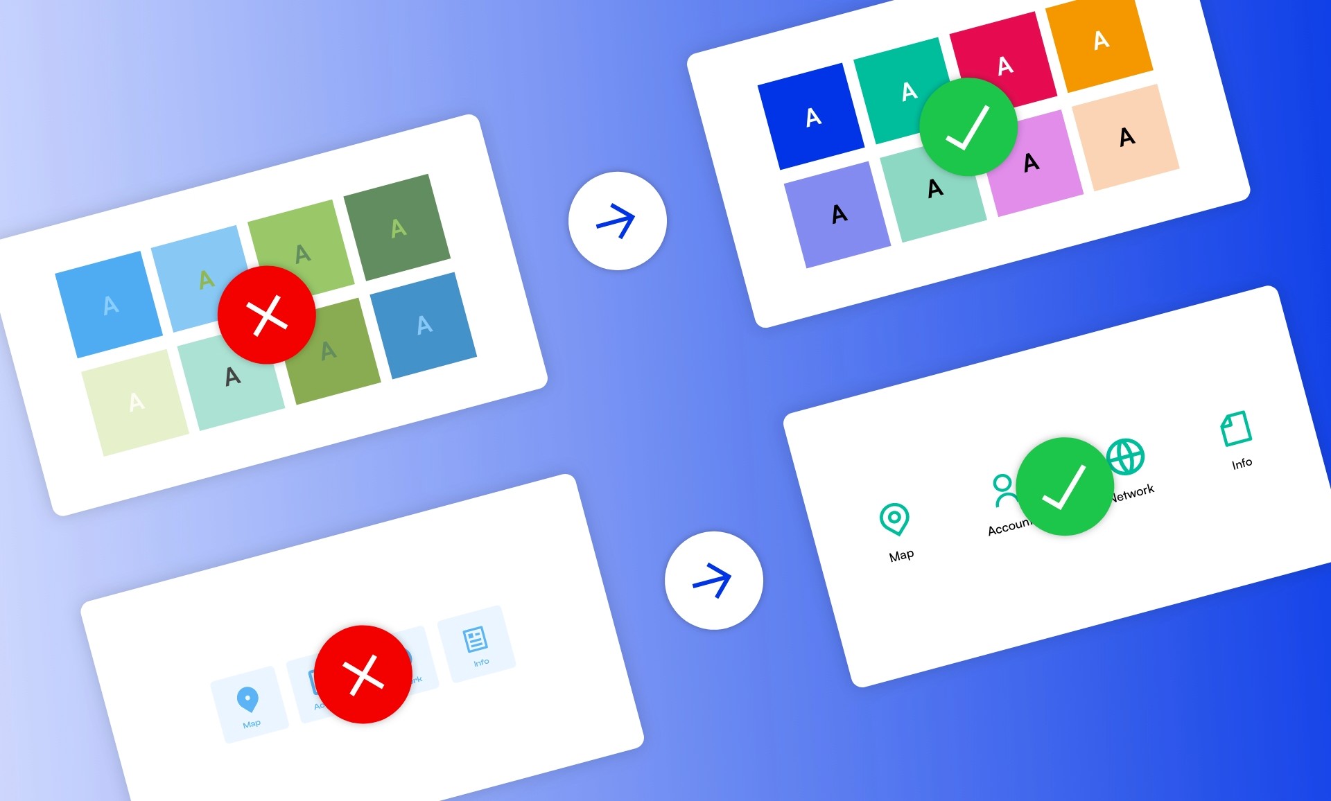
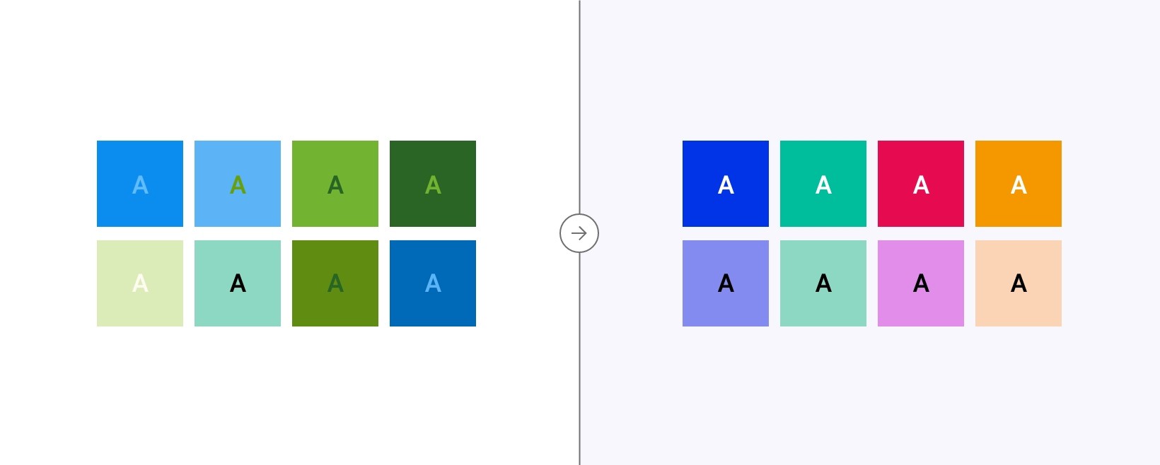
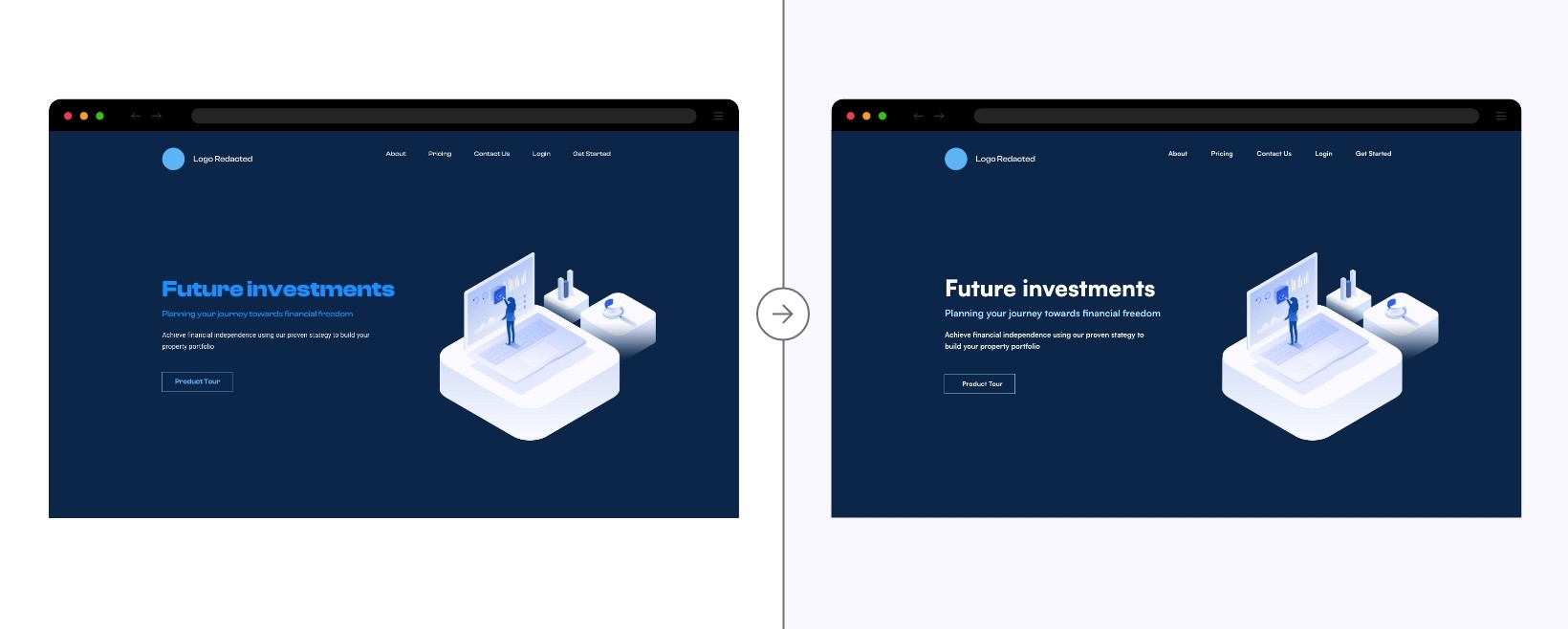
The revised color palette was carefully crafted to ensure accessibility, particularly for individuals with color blindness and other visual impairments. Every color meets the WCAG color contrast ratios, ensuring legibility across various types of screens, whether viewed on mobile or desktop devices. Beyond color alone, this palette works in tandem with functional components like steppers, modals, and cards, using size, shape, and positioning to enhance user perception. This multi-dimensional approach ensures that components remain clear and functional, regardless of the user’s visual ability, while maintaining aesthetic consistency across the brand.
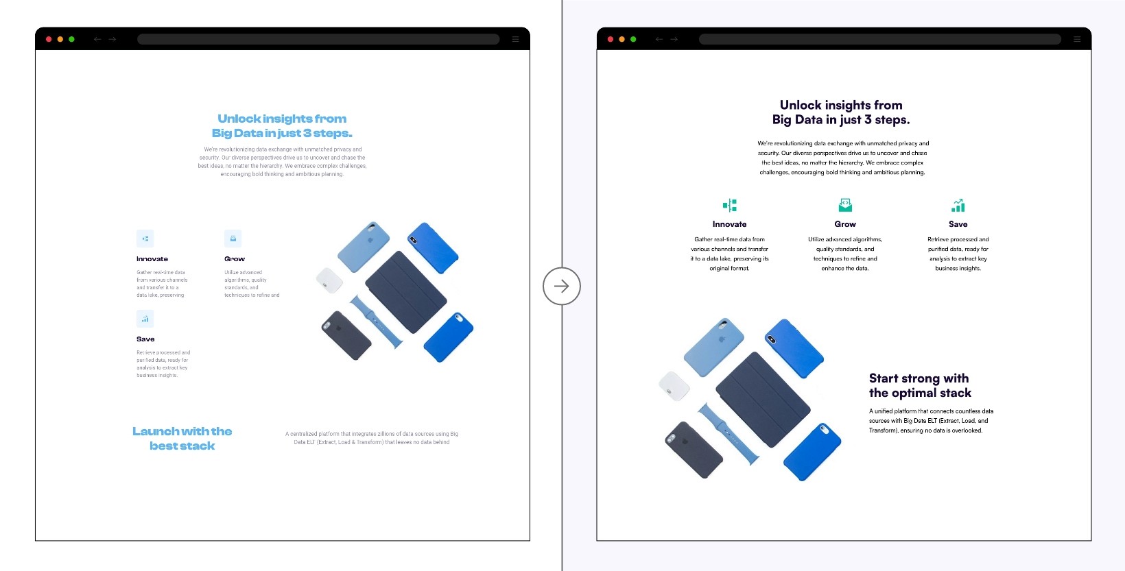
The new typography is designed for improved legibility and accessibility, optimizing user experience through better readability. I selected typefaces with adaptable weights, ensuring flexibility in headers, subheaders, paragraphs, and hyperlinks, all while adhering to accessibility guidelines. Removing bold text from body copy helps eliminate strain for users with visual disabilities. Additionally, the new left-aligned text replaces much of the previous center alignment, a crucial change for those with cognitive challenges. Keeping body text left-aligned ensures readability by allowing the eyes to follow a consistent starting point, which is particularly vital for long-form content.
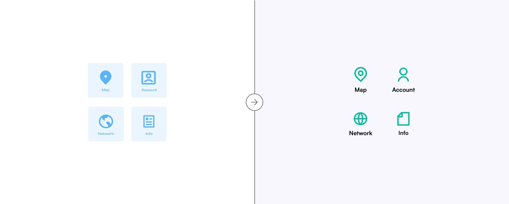
The updated iconography promotes consistency and clarity. By transitioning to line-based icons, I’ve ensured that all elements are visually related, making their functionality more intuitive. This approach creates a cohesive system, where icons operate like an alphabet—easily recognizable and uniform. The removal of light blue containers around the icons not only improves contrast but also eliminates potential confusion with interactive buttons. This visual distinction between clickable buttons and non-interactive icons reduces user friction and makes the interface easier to navigate.
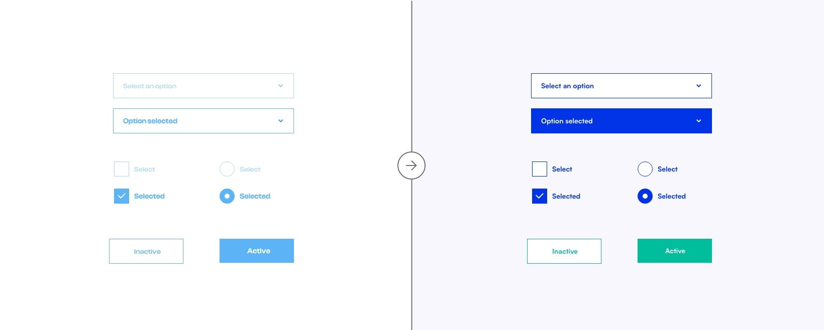
The reimagined components prioritize inclusivity for users with physical and motor disabilities. They’re designed to work seamlessly with screen readers and accommodate speech-only interactions or keyboard navigation. These components also shine on mobile and touch devices, with buttons clearly distinguishable from other elements such as icons. Additionally, all button states (hover, selected, default) meet WCAG contrast standards, ensuring visibility and accessibility throughout the user journey. This focus on inclusivity empowers users of varying abilities to engage with the brand effortlessly.
The refreshed layout introduces a linear, logical structure that presents content in a shorter, more digestible format. This approach improves user focus and ensures the layout adapts well to different devices. By emphasizing a clear visual hierarchy, I’ve made the most important information more prominent, allowing users to scan content quickly. Visual hierarchy is achieved through variations in size, color, spacing, and depth, guiding users’ attention and improving overall interface aesthetics. This design strategy ensures that information is not only accessible but also visually appealing.
This rebranding project exemplifies how accessibility can be embedded throughout a design system without sacrificing creativity or user experience. By incorporating accessibility into every aspect of the redesign—from color choices to layout structure—I’ve ensured that the brand is usable by the widest possible audience. Accessibility in design is crucial because it provides equal access to information, regardless of a person’s physical or cognitive ability. This approach not only broadens the brand's reach but also fosters a more inclusive digital environment for all users.
